Every page on a corporate website aims to encourage visitors to continue browsing or take a specific action. As the most direct call-to-action, the arrangement of buttons often determines whether visitors stay engaged or leave. This article discusses button layout, hierarchy, and copy from the perspective of common corporate website pages, helping site managers or operators make better decisions in daily maintenance.
Clarify the Primary Goal of Each Page
Before arranging buttons, define the core task of the page. Corporate website pages generally fall into several categories: the homepage builds trust and directs traffic, product pages showcase value and encourage inquiries, case study pages demonstrate credibility and foster partnerships, and contact pages provide communication channels. The number and hierarchy of buttons should vary accordingly.
Each page should have one primary call-to-action, with other buttons serving as secondary options. For example, on a product detail page, the main button might be "Request a Quote" or "Get a Quote," while secondary buttons could include "View Case Studies" or "Download Resources." If every button tries to stand out, visitors may feel overwhelmed and unsure where to click first.
Position Buttons According to Browsing Habits
When visitors scan a page, their eyes typically move from top to bottom and left to right. Buttons should appear where visitors are most likely to show interest, rather than being fixed at the bottom. Especially for above-the-fold content, if visitors want to learn more after reading, the button should be nearby, eliminating the need for extensive scrolling.
A common practice is to place the primary button at the end of the above-the-fold content and repeat it in the middle or at the end of the page for those who have scrolled down. For long pages, a floating "Contact Us" button in the sidebar or bottom can be helpful, but ensure it does not obstruct main content.
Differentiate Visual Hierarchy Between Primary and Secondary Buttons
Buttons on a page should have a clear hierarchy. Primary buttons typically use high-contrast colors, such as the company's brand color, orange, or green, while secondary buttons may use gray or outlined styles. This allows visitors to instantly identify the preferred action.
For instance, on a service introduction page, the primary button might be "Get a Free Consultation," with a secondary button like "Explore More Services." When placed side by side, the primary button should be on the left or in a more prominent position. If the main action is "Buy Now," avoid placing "Contact Customer Service" next to it, as this could distract from the primary goal.
Use Specific and Action-Oriented Button Copy
The text on buttons directly influences click-through rates. Avoid vague phrases like "Click" or "More." Instead, use descriptive language that conveys the outcome. For example, "Get the 2024 Price List" is clearer than "Submit," and "Book a Free Assessment" is more compelling than "Contact Us."
Additionally, the copy should match the tone of your corporate website. If your target audience is in traditional manufacturing, "Download Product Brochure" may be more appropriate than "Download Now." For internet service providers, "Start Free Trial" might be better. Button copy should align with the page content—if the page addresses a specific pain point, the button could say "Solve This Problem."
Ensure Mobile-Friendly Button Usability
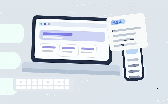
A significant portion of corporate website traffic comes from mobile devices, so button usability on mobile cannot be overlooked. Buttons should not be too small; a minimum height of 44 pixels is recommended for easy tapping. When multiple buttons are arranged, ensure sufficient spacing to prevent accidental clicks.
On mobile pages that require extensive scrolling, consider fixing the primary button at the bottom or using a floating button, but be mindful not to occupy too much screen space. If the page includes a form, the submit button should be placed near the form rather than at the very bottom of the page.
Align Button Placement with Content Flow
Buttons should not exist in isolation; they should appear where the content is most persuasive. For example, on a case study page, after a visitor reads a detailed client story and thinks, "We have a similar need," placing a "Get a Similar Solution" button at the end of the case is more effective than at the top of the page.
On the homepage, buttons are typically placed after key information blocks, such as "Learn More" after an "About Us" summary, or "View Our Services" after highlighting service advantages. The stronger the relevance between the button and the content, the higher the likelihood of clicks.
Regularly Review Button Performance
Button arrangement is not a one-time task. After the website goes live, use backend analytics or manual testing to monitor click behavior. If a button has a low click-through rate, it may be due to poor placement, unappealing copy, or a mismatch with the page's goal.
We recommend reviewing the button layout of key pages quarterly, using page traffic data and user feedback to make adjustments. A/B testing can also be valuable—for example, comparing "Request a Quote" versus "Get Pricing"—but ensure the test runs long enough for reliable results.
In summary, button arrangement on a corporate website should center on the page's objective, considering visitors' browsing habits and ease of use. Through strategic placement, clear hierarchy, and specific copy, you can guide visitors toward the next step, thereby enhancing the overall effectiveness of your website.